Pagurus hirsutiusculus, commonly known as the hairy hermit crab, is a key intertidal species found along the California coastline. As scavengers, these crabs play a vital role in nutrient cycling by consuming dead organic matter, preventing waste buildup, and contributing to the overall health of their ecosystem. However, over the past two decades, climate change has altered habitat conditions, potentially leading to shifts in their distribution and declines in their populations. Rising ocean temperatures, habitat loss, and changing food availability may all contribute to these changes.
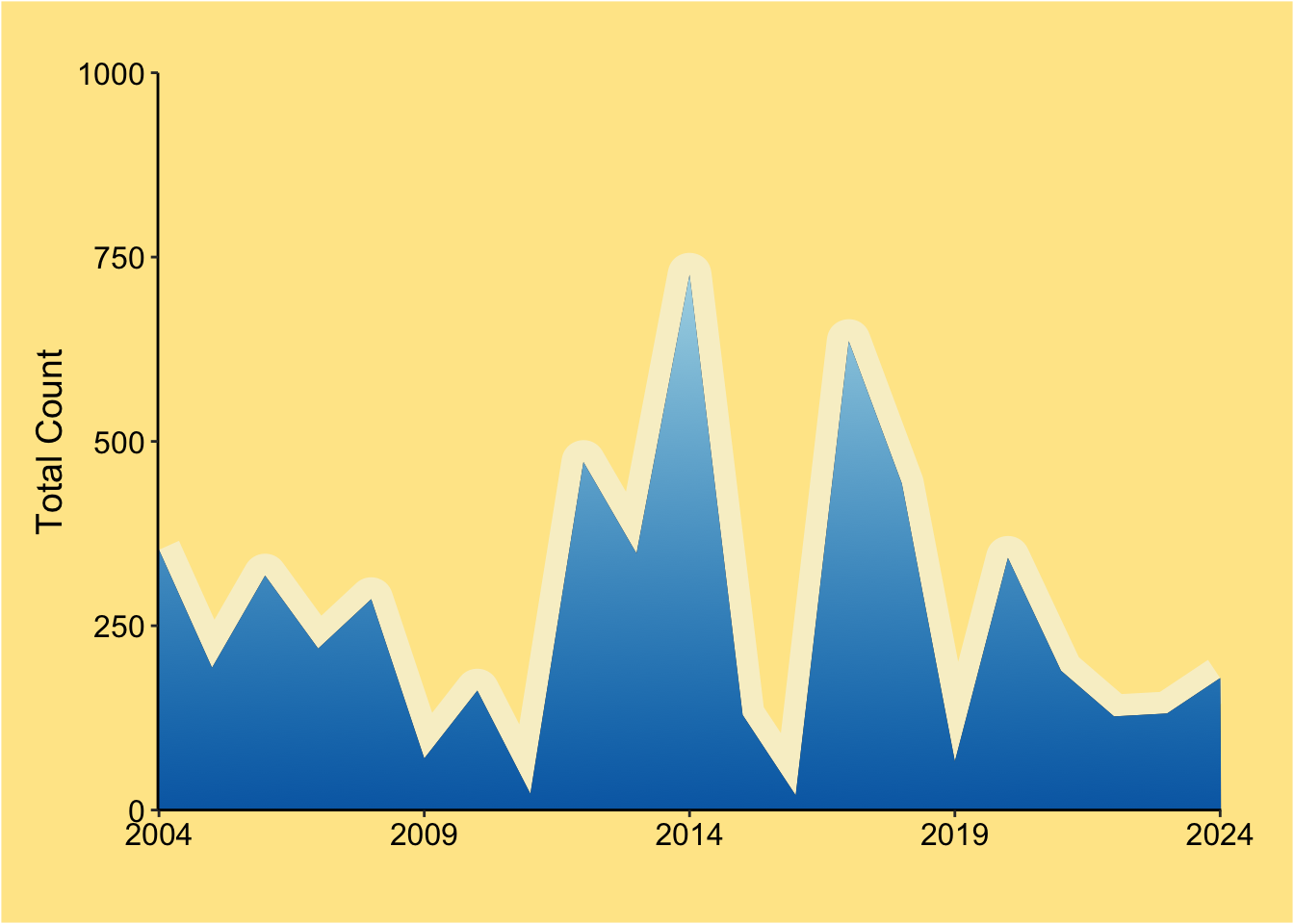
This infographic uses biodiversity survey data from the Multi-Agency Rocky Intertidal Network (MARINe) to illustrate how the distribution and abundance of P. hirsutiusculus have changed between 2004 and 2024. By visually comparing these two years, we can explore whether populations have declined, migrated, or remained stable along the California coast.
Approach
To investigate these changes, I focused on visualizing geographical differences and abundance trends at MARINe survey sites over time. Some key questions that guided my analysis include:
Is there evidence of a northern migration in response to climate change?
Are there notable differences in abundance across California’s georegions?
Has the population declined significantly over time?
Although this is a serious topic, I wanted to present my findings in an engaging and accessible way for a broad audience. By incorporating a beach-inspired design, I aimed to create an informative yet visually appealing representation of the data.
Design Process
Designing this infographic required careful consideration of how best to communicate both numerical and categorical data. After testing different approaches, I selected line plots, lollipop charts, and maps because they effectively highlighted the key patterns in my dataset.
To enhance engagement, I used a cohesive beach theme, incorporating natural elements such as shells, bird tracks, and rocks to create a familiar and inviting visual context.
Line Plot (Abundance Over Time): I modified the design to resemble a shoreline, using shading techniques to mimic ocean tides. One challenge was making the shaded area under the line appear natural in a 2D visualization.
Lollipop Chart (Abundance by Georegion): To depict abundance across California’s regions, I positioned the hermit crabs at varying distances along a beach background. One of the biggest challenges was correctly flipping the chart in R to align counts from north to south.
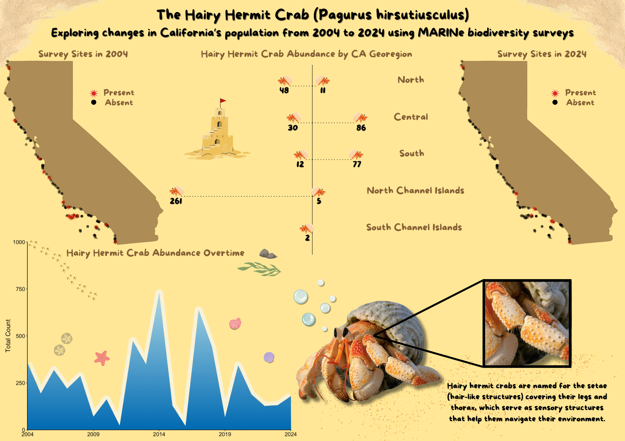
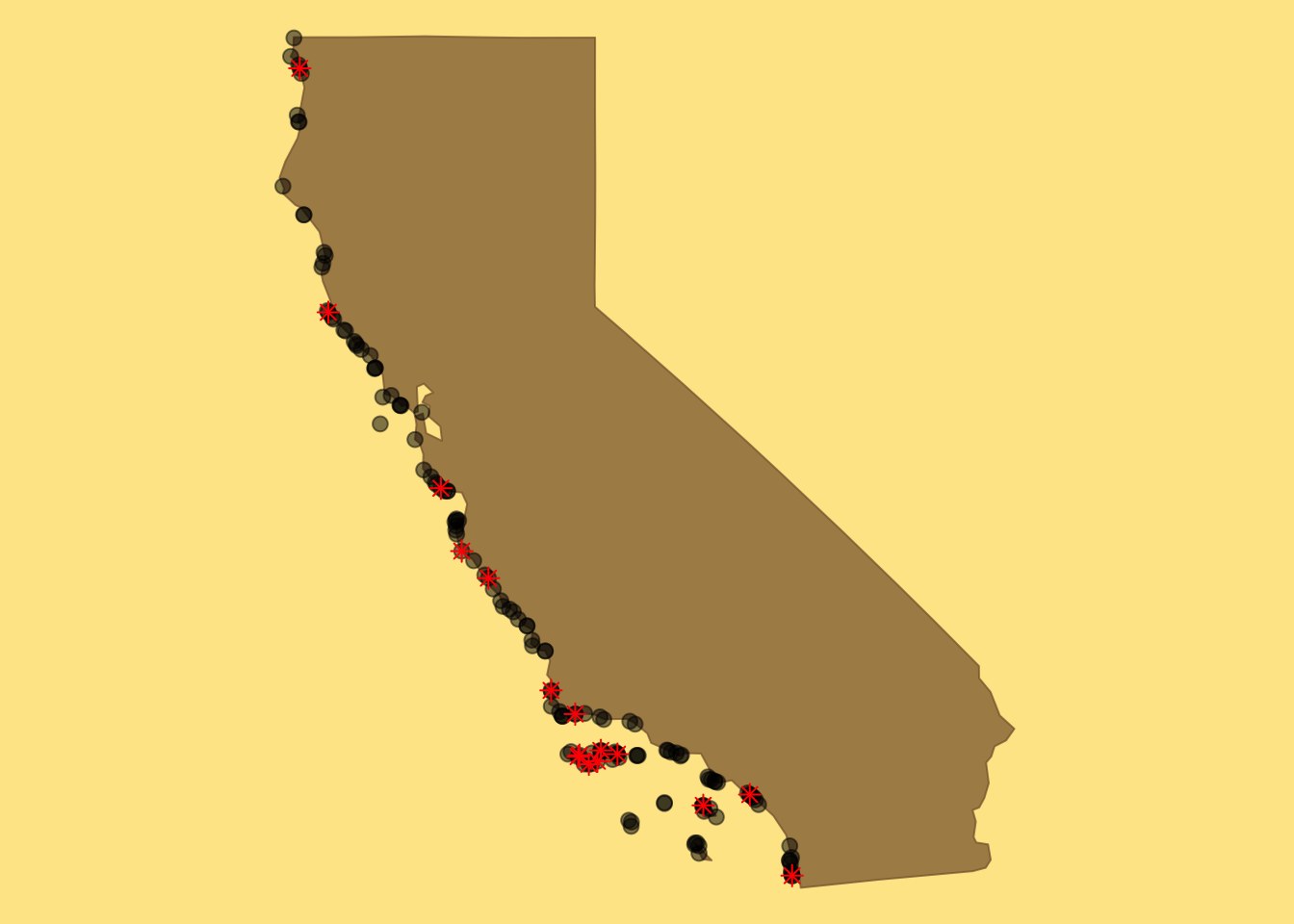
Maps (Species Distribution): Using a simple California basemap, I differentiated survey years using red and black markers, making it easy to spot changes in species presence and absence across MARINe sites.
Another major design decision was the layout of the infographic. I divided it into two sections, placing 2004 on the left and 2024 on the right, with the lollipop chart acting as a visual divider. This structure helps guide the audience through the data, making it clear how distributions and abundances have changed over time.
Visualizations
All visualizations were created in R using ggplot2 and later refined in Canva for personalization and styling. Click through the sections below to explore the coding choices behind each visualization!